Every Cell phone plan has advantages and Disadvantages. Having used T-Mobile for the last 15 years I have come to realize that the perks a cell phone company offers can either make or break that company.
Recently I became aware of Google Project Fi (Fi as in Wi-Fi). This is a cell phone plan created by Google. Although this plan doesn't include many of the perks of other plans such as T-Mobiles ability to stream music and videos without using data it has a couple of major advantages that make it worth checking out.
First, Project Fi uses both the Sprint and T-Mobile cellular network. Although neither of these networks is as large as say Verizon or AT&T together they provide very competitive coverage. T-Mobile has decent coverage where I live but I have noticed when I travel to places such as Idaho or rural parts of Utah that the coverage is not as great. Sprint on the other hand has some decent and surprising coverage in certain rural areas. Project Fi gives the best of both worlds. You can use both networks and it strives to place you on the data network that has the fastest speeds in the location you are at.
Second, You don't have to pay for the data you don't use. I am not really a heavy data user. On T-Mobile I had a 1 GB per month plan. I used maybe 300 MB on any given month. Although Some data plans allow you to carry over your data to the next month and build up a reservoir of unused data I personally like Project Fi's Idea better. If you don't use the data you don't have to pay for it. 1 GB of data - $10 or $1.00 per 100 MB. With Project Fi you only pay for what you use. This means that you don't have to pay $40 per month for 2GB of data that you will never use. Instead you get reimbursed for the data you don't use so you may only pay $23 + Tax if you only use 300 MB's. To me this is a great service. It also works out well for people who use a lot of data. If you go over your assigned allotment they will simply add the excess amount to your next months bill. You don't pay overages either so its a winning situation.
Third, If you use the Google hangouts app then you can receive text messages on all your devices. This includes computers and tablets. As long as your Google account is connected to that device. This can be extremely convenient. I don't really like carrying my phone around with me so if I am nearby a computer or using my tablet it is nice to have text messages show up on that device.
Despite these two advantages Google Fi has one major flaw. The network currently only supports three phones, the Nexus 5x, 6P and 6. Having used a Nexus phone for the last two years I am fine with this. However, if you are a fan of the Samsung Galaxy line or iPhone you are out of luck. Nexus phones are cheap but they may not have all the features that you are used to with your galaxy or iPhone.
Overall if you don't mind using a Nexus phone I would definitely give Project Fi a try. The base price is $20 per month which is also a great deal. Over the past month of using this service I haven't had any problems.
Jex Reviews
A bunch of reviews on products, movies, books, and anything else you ever wanted to know about. These are no joke either!
Friday, November 27, 2015
Saturday, January 24, 2015
Photoshop CC (2014)
To those not familiar with the many hats that librarians
wear, it may come as a surprise that I use Photoshop all the time for work. To
be perfectly honest I had a small amount of knowledge concerning the program
when I started my current job two years ago. However, having been in charge of
creating displays, short videos, and creating posters for events I have found
the program indispensable.
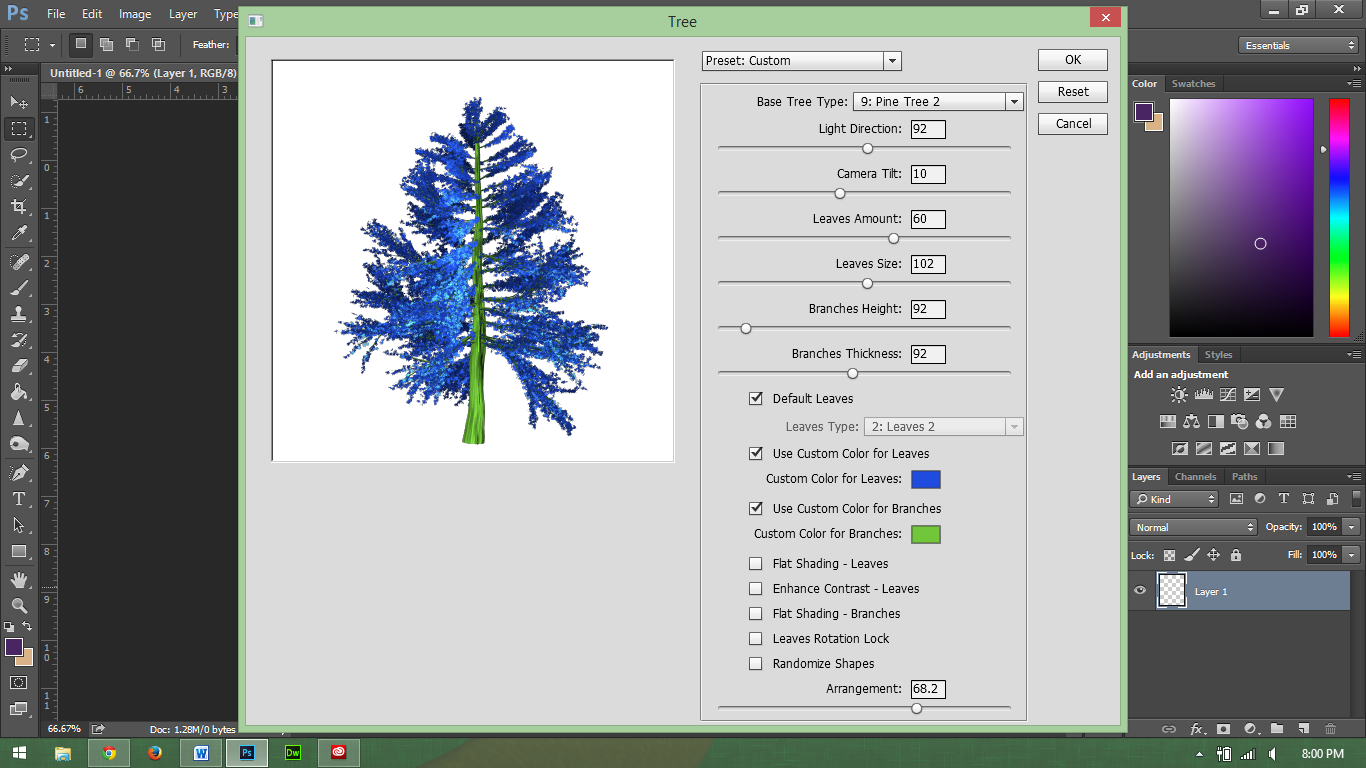 |
| Who doesn't want to create a blue tree? |
The current Photoshop CC (2014) brings many new features to
the table not included in previous
releases, including the ability to render
flames and trees. While I don’t use these two tools regularly, I do find that
Photoshop is perhaps one of the easiest and most useful photo editors to use
and learn.
I realize that I say this having years of experience using
the product but it is true. Having a basic knowledge of Photoshop will allow
someone to edit a picture, a more advance knowledge will allow someone to further
manipulate images and create original pieces of art that don’t even start with
images.
In addition, much of the layout for Photoshop is similar to
other adobe tools such as InDesign and Illustrator, although I do not claim to
be an expert at using these tools; however, I do find their interface familiar
with my limited experience.
Photoshop can be used to manipulate an image; I find that I
like to use it in creating original works of art. Just recently, I used it to
create this video covering the profession of being a librarian. I am new to
making characters, but with my knowledge of Photoshop, it makes it a bit
easier. For someone who is not good at drawing, this is actually simple and
fun.
For those who are not familiar with Photoshop, I would
highly recommend learning how to use this, Adobe offers some basic instruction
online. Also you should be able to find a class in your community on the
product.
The one negative side to Photoshop CC is the cost. For most
individuals creative cloud will cost anywhere from $119 - $359 per year
depending on the package you buy. Some employees and university students can
probably get the program at a discount through their school or employer. Also,
Adobe does give discounts on its products for students (see: https://creative.adobe.com/plans).
Besides the price, Photoshop is a tool that I would
recommend that everyone at least try using. Besides my personal use, I have
also found it helpful to know Photoshop for job security reasons. Since I am
familiar with this technology, I am able to help others learn this software and
use it to complete projects.
Saturday, September 20, 2014
Remember the Pager?
 |
| The LG G Watch. |
Smartwatches are not a new thing. In fact, the first one I
remember hearing about was the Timex Fossil Wrist PDA. You also had the Microsoft
SPOT watch, which received information over FM frequencies.
While the idea isn’t new the concept has been getting a lot of
press attention lately. With Google’s Android Wear just released a couple of
months ago I decided to try an LG G Watch.
The G Watch definitely has some power to it. It comes with a
1.2 GHZ processor as well as 4GB of Storage. For those who don’t speak tech that
means it has the same stats as a cheap Android Phone. It doesn’t have Wi-Fi or cellular
service on its own. Instead it connects to your phone via Bluetooth (Requires Android 4.4 or
newer) and gets its data from there.
This brings up my one major complaint about this device.
With the amount of power that it has, all it does is give you notifications
from your phone. Sure, it is nice to read your text messages and emails as well
as see map directions on your watch but why have such a powerful device do
this? This device could be doing so much more. It has the power but it falls
short. Also for $229 this is an expensive notification device. If the price
came down to about $100 I would say that it is worth it.
Let’s go over some of the aspects of the watch in more
detail.
The Display is quite nice on the device. You would be surprised
how easy it is to read most emails on a 1 by 1.5 inch display. The display is
easy to see. The one exception to this might be if you are in direct sunlight.
However, since I work inside most of the day I haven’t seen this as a problem.
 |
| The color screen works well indoors |
The device has no knobs or any physical buttons for that
matter. Everything is done with a touch screen. It also uses a wireless charger
for power. One of the major complaints I have heard about the watch is the
battery life. While it is true that most watches have batteries that last for
at least five years before being replaced; I have not had any problems with the
watch dying on me. In most cases, the watch will still have about 60percent
left when I take it off at night. That is after being used all day. Even when
the navigation had been used and I had it on for about 18 hours, it still had
plenty of life left.
Along with using the touch screen, you can also interact with
the device by talking to it. This works the same as Google Now where you say “OK
Google” and then give your command. This works OK for text messaging. For the
most part this is only useful in controlling your phone. You can tell the watch
to open a certain app or website on your phone and it will do it. I don’t
really see the point in this though since I could just as easily type in the
Web address or open the app on my phone.
Ultimately, all the watch is just an extension of Google Now
and your phone notifications. I guess it gives us an excuse to be a bit lazier,
now we don’t even have to reach for our phones. The nice thing is that it does
vibrate on your wrist instead of in your pocket or desk. This makes it easier
to know when you have a notification.
You can also control your phone camera with the watch.
Although I haven’t done this yet I could easily see how this would be helpful
in taking group pictures or selfies from a distance. Other than giving notifications,
the watch doesn’t do much. I am hoping that they change this in the future, as
there is a lot of potential here.
Another downside for some might be the width of the watch
the watch is probably about twice the width of a regular watch. This might be OK
if it had a rounded screen but it doesn’t. This makes some awkward space on the
sides of the watch where you can see light going through. After using the watch
for a week this doesn’t bother me but I am hoping that later itineration of the
device will be thinner.
 |
| The Watch is probably about 1.5 CM in width |
At its current cost of $229 the LG G Watch is not really worth
the cost. Yes, I have enjoyed having this device and I can see potential for growth,
but I don’t think the technology is quite there yet. If the device ever comes
down to about $100 then it might be worth it, but for most people I would tell
them to wait at least a year or two for the devices to get more functionality
and fashion. On the other side, this device could be exactly like the pager?
Remember, those notifications devices from the 1990s? They were replaced by
cell phones because the phone had more usability.
Wednesday, April 2, 2014
Day One - journal app
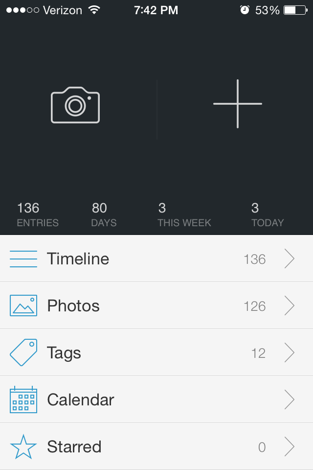 |
| Main menu |
I have and am reviewing the iPhone version of Day One, but I assume the Mac version is very similar (unfortunately, there is no Android version I am aware of yet, but similar apps exist for Android). The interface is simple and does everything I would want it to do plus a little more. The goal of the design team was to make keeping a journal as simple as tweeting or text messaging, I think they have done a good job, especially considering the app costs about the same as a nice hardbound journal ($4.99).
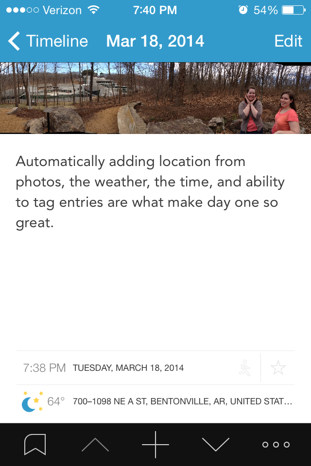 |
| Journal entry view |
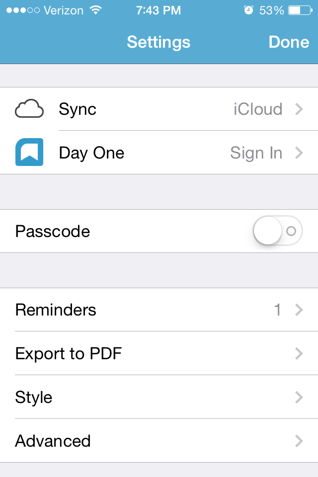 Now, the all important export and saving features. What good is a journal on my phone if I can't put it somewhere in a permanent format (AKA printed)? What if I want to send it to a someone else, or what if my phone crashes? All of the data can be backed up to the icloud or dropBox. The app can export your entry(ies) as a .pdf or send it straight to the e-mail app with the photo as an attachment. A very useful feature is exporting only entries with specific tags. For example, lets say I just had a baby and some of my entries are about her. I can tag those (very easily), and export only those as a pdf, then send it to family members. A new ("publish") feature lets users publish a mini-webpage with the journal entry, and allow it to be shared to whomever they wish.
Cons: The app only lets you attach one photo per entry. This isn't too big of a deal because I can just make another entry right after it. When scrolling through entries, the top and bottom quarters of photos are cut off (to make more room for the text?). The photo can be viewed full screen with a simple click, but I would still rather see it all there. The top often has faces in it, so the photo I see when scrolling is a bunch of headless folks. When iOS gets updated, entries may disappear. The help guide lists a few ways to get them back, which worked for me.
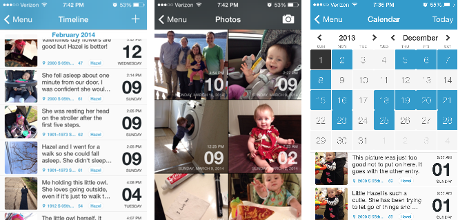 |
| Three primary ways to view entries. Timeline, photo, and calendar. |
*I actually got this for free from the iTunes store anniversary, this is the best app of the bunch in my opinion (its the only one I actually use).
Sunday, November 17, 2013
Little Inferno
Little inferno is a very strange fireplace simulation game that is more about being a pyro than anything else. It has a very dark sense of humor. At the same time, it also is a good game to relieve stress. Especially for those of us who liked to burn stuff up in the fireplace as a kid.
The game will set you back $10. If you enjoy weird games and burning stuff up I highly recommend it. The below video is perhaps the best description I can give it.
Monday, October 21, 2013
Has it aged well? Monster Bash
 |
| Who doesn't like an intro with a green Zombie? |
Compared to my last review Monster Bash is a plat-former that
has stood the test of time quite well. Unlike
Jazz Jackrabbit this game is more about solving puzzles than speed. While the first three levels are quite easy,
level 4 takes the difficulty level up a couple of notches.
For this review, I only looked at the shareware version of
this game. This version includes part 1
of 3.
For those who have not played this game before, the main
point of this game is to free all the captured dogs and cats throughout the
level. In some cases the animals are
hidden, while in other cases they are in plain sight.
Overall this game is still fun to play and includes many
challenges to keep both adults and children entertained. I recommend you download the game today from
3D Realms and play it for Halloween 9/10 Skeleton Hamsters.
In order to play this game you will need an MS-DOS emulator
such as DOS box.
Monday, October 14, 2013
Has it aged well? Jazz Jackrabbit Holiday Hare
 |
| What is that red flying thing? An angel? or an Angel daemon. |
As a kit who grew up only playing PC games, Jazz Jackrabbit
was perhaps one of the best DOS games there was besides Hocus Pocus and Raptors:
Call of the Shadows. I remember playing
the shareware versions of all of these games over and over again. As a kid these were really fun games.
I have replayed a few of these games as I have gotten older,
some games such as Hocus Pocus are alright, however Jazz Jackrabbit Holiday
Hare really has not aged all that well.
Looking at the screenshot above you can see that the graphics are
alright. However, the controls are what
really makes this game loose its playability.
You move way to fast and you are bound to run into multiple bad guys
before the end of the level.
I really have nothing against a green rabbit with a gun, or
the artistic style. Considering the time
this game looks quite good. But if you
try and play this game even on easy, you will die. Not because the game is hard but because the
screen does not give you enough space to see ahead.
Overall as this game looks alright but hasn't aged well I
give it 6/10 tomatillos.
Subscribe to:
Comments (Atom)